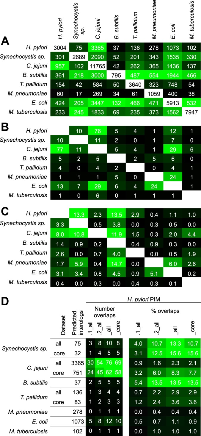
Fig. 4.

Comparison of interactome conservation. A, Number of interologs predicted from published bacterial interactomes. White fields: PPIs per interactome (diagonal); the number of predicted interologs are plotted above or below (read by column), respectively. B, Number of interologs confirmed experimentally and C, Percentage of overlaps. Data sources used, see supplemental Table S4. The field color symbolizes an increasing number/fraction of predicted/conserved PPIs from black to green. D, Breakdown of H. pylori data sets. The figure compares the number of predicted interologs and conserved PPIs in the H. pylori PIMs from large scale screens of different species (used as prediction sources). “All” and “core” data (if available) were used as provided by the primary publications. Color symbolizes an increasing number of conserved PPIs from black to green. All studies used Y2H methods except of M. tuberculosis (bacterial 2-hybrid) and M. pneumoniae and E. coli (TAP-MS)). The highest overlaps tend to be found between the H. pylori PIMs with other Y2H studies. Note that our new data (PIM.2) provides increased numbers of conserved PPIs compared with PIM.1.
