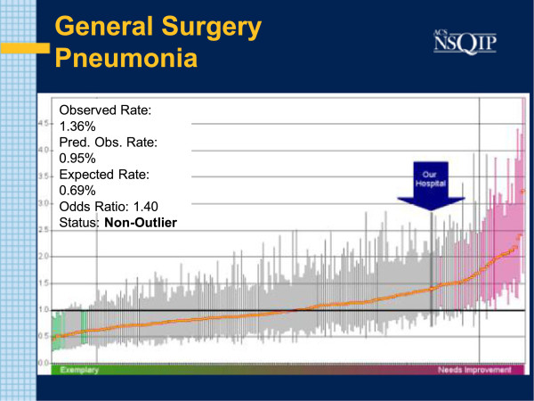
Figure 1.
SAR: PNEU July 2011. Caterpillar chart with bold arrow noting study institution results for pneumonia. O: E odds ratio is 1.4. Each line corresponds to the result of one particular hospital. More successful performers lie to the left. Better than average hospitals show a Confidence Interval (CI) entirely below the mean (horizontal black line). Shaded green and pink are outliers.

