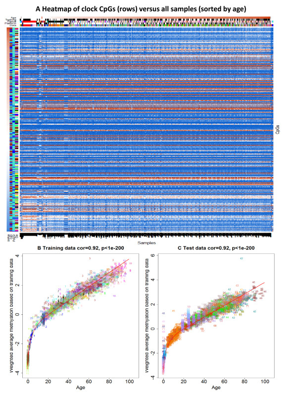
Figure 6.
Heat map of DNA methylation levels of the 353 CpGs across all samples. (A) The heat map color-codes DNAm levels: blue and red for beta values close to zero and one, respectively. Note that DNA methylation levels only change very gradually with age. The 353 clock CpGs (rows) are sorted according to their age correlation. The first row color band, denoted 'corAge’, color-codes whether a CpG has a negative (blue) or positive (red) correlation with age. 'CpG’ indicates whether a CpG is located in a CpG island (turquoise), shore (brown), or outside of CpG islands. 'PolyGr’: blue for CpGs near a Polycomb group target gene. 'Chr’ color-codes chromosomes. The DNA methylation samples (columns) for which chronological age was available are sorted according to age, tissue, and data set. The column color bands visualize properties of the samples. 'Age’: white for age zero and dark brown for the maximum observed age of 101 years. 'Training’: black for training set samples. 'Tissue’ color codes tissue type. 'Platform’: black for Illumina 450K. Note that few data sets have a pronounced effect on the clock CpGs. The largest vertical band corresponds to the buccal epithelium samples from 15 year old subjects (data set 14, color-coded midnight blue in the column band 'Data’). (B) The weighted average of the 353 clock CpGs versus chronological age in the training data sets. The rate of change of the red curve can be interpreted as tick rate. Points are colored and labeled by data set. (C) Analogous results for the test data sets.

