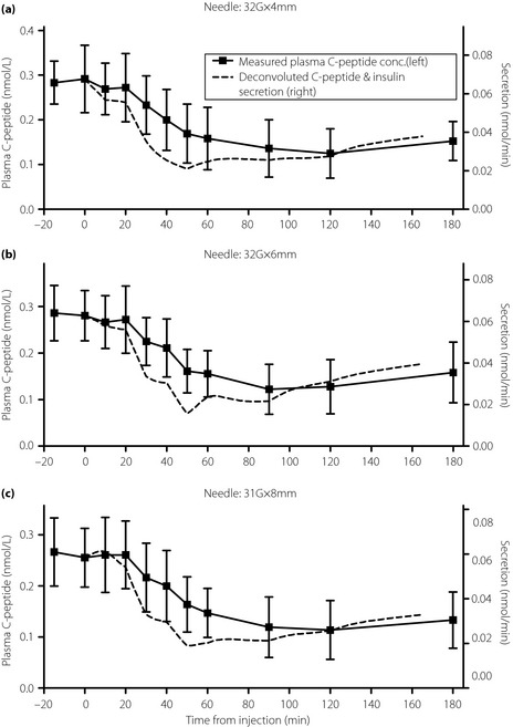
Figure 3.

Plots of the measured plasma C‐peptide concentrations (squares; mean and standard deviation) and interpolated values (solid line, left axis) along with C‐peptide and insulin secretion rates (dashed line, right axis; mean values). (a) 32‐G × 4 mm (32G × 4) needle. (b) 32‐G × 6 mm (32G × 6) needle. (c) 31‐G × 8 mm (31G × 8) needle. The left and right axis scales are normalized so that the C‐peptide concentration and secretion overlap at 0 min.
