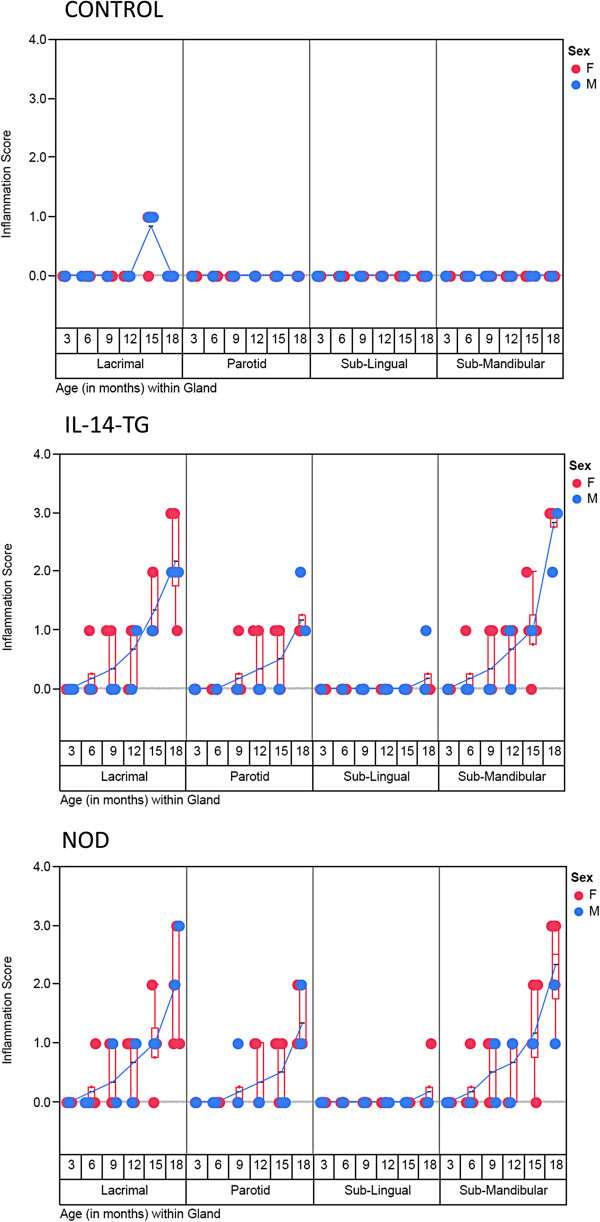
Figure 2.

A scatter plot of inflammation score on Y axis was plotted against the type of gland grouped with age of the mice (in months) on X-axis. The progression of inflammation from 3 to 18 month time point can be observed for each gland and category of mice. Red and Blue circles indicate Female and Male Mice respectively. A blue line connects the mean value of inflammation score for each time point and gland. The data points (n = 6 for each time point/gland/type of mice) are jittered but a box plots (red) have been provided to depict the interquartile range and distribution for the observed levels of inflammation.
