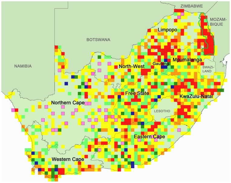
Figure 1. Southern African Bird Atlas Project (SABAP) comparison map for the Secretarybird, extracted 19 April 2013.
This map compares SABAP1 and SABAP2 reporting rates. South African province names are given in black, neighbouring countries are labelled in grey, and the Kruger National Park, in the north-east of South Africa, is outlined in green. Coloured squares are quarter-degree grid cells (QDGCs; 15'×15') in which the species was observed in either project. Reporting rates are compared using the Z-statistic (see text). SABAP2 reporting rates were lower than SABAP1 in red, orange and yellow grid cells, and higher than SABAP1 in light and dark green and blue grid cells. In red grid cells Z<–2.58 (important decrease), in orange –2.58<Z<–1.64 (distinct decrease), and in yellow –1.64<Z<0 (decrease probably attributable to sampling variability). In light green grid cells 0≤Z<1.64 (increase probably attributable to sampling variability), in dark green 1.64<Z<2.58 (distinct increase), and in blue grid cells Z>2.58 (important increase). Pink grid cells are those which had not yet been covered in SABAP2. Therefore, red, orange and yellow grid cells indicate areas of potential conservation concern, whereas green and blue grid cells indicate areas of apparent population increase.

