
Figure 1. Group-by-time analysis (F test).
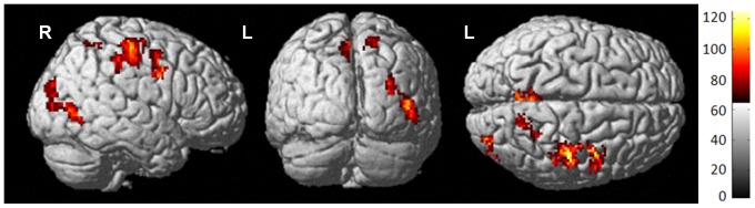
Surface rendering of perfusion differences from baseline to one month post-treatment for all groups (P crit<0.001 uncorrected, k = 100). Colored areas indicate statistically significant changes between groups and/or times; red to yellow color scale indicates increasing statistical significance, with yellow areas indicating the most significant regions.