Figure 3.
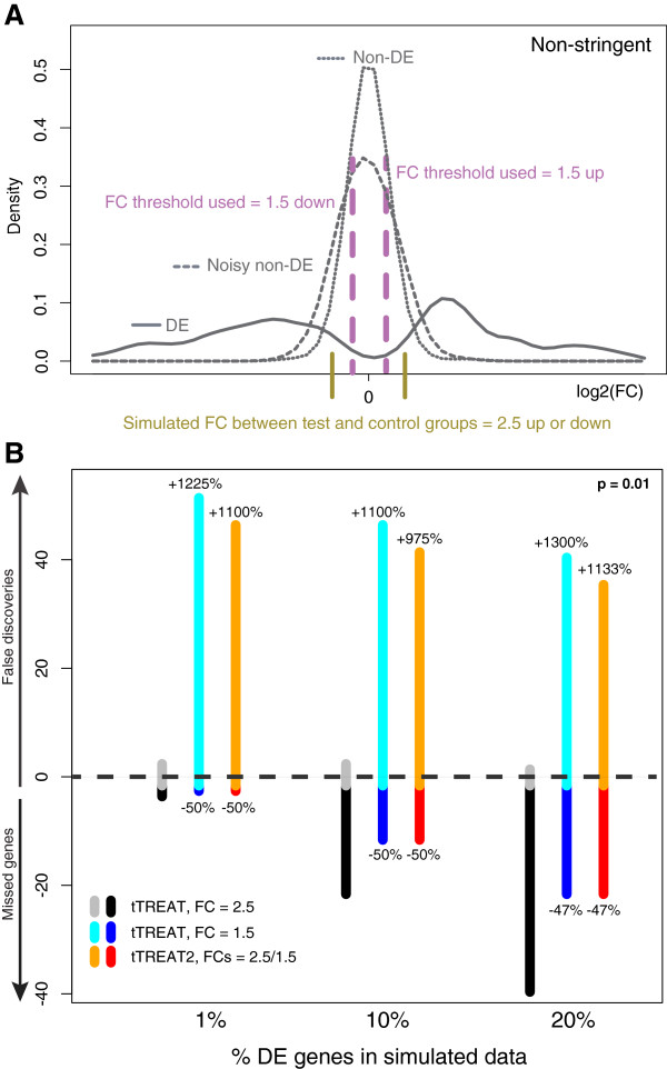
The two-stage design in a non-stringent test situation. (A) Data simulation experiment: empirical density functions of the DE genes (solid curve), noisy non-DE genes (dashed curve), and non-DE genes (dotted curve). The vertical olive lines indicate the simulated FC difference ω between test and control groups. The choice of ω determines the peak of the density function of the DE genes, which lies a little further to the right. The non-DE genes are distributed around a FC difference of 0. A non-stringent test relative to a FC threshold τ, as indicated by the purple dashed lines, identifies all the DE genes to the right or left of these lines, but also many non-DE genes. (B) The positive y axis shows the average number of false discoveries, and the negative y axis shows the average number of missed genes, over 400 generated datasets for three tests relative to a FC threshold. The x axis shows the percentage of DE genes (1%, 10% and 20%) that is simulated in each case. Significance is set at p = 0.01. The DE genes are simulated with respect to a FC difference ω of 2.5. Here, the reference test is tTREAT with a FC threshold τ of 2.5, thus a test with τ = ω (gray and black). The non-stringent test with a FC threshold τ of 1.5 is in cyan and blue. When using a safety margin in tTREAT2 (orange and red), the number of false discoveries increases much with regard to the reference test (tTREAT with τ = 2.5), as marked by the positive percentage above the orange bar. This increase is not as large as is the case with the non-stringent test. The negative percentages underneath their respective bars show the decrease in missed genes.

