
Figure 2.
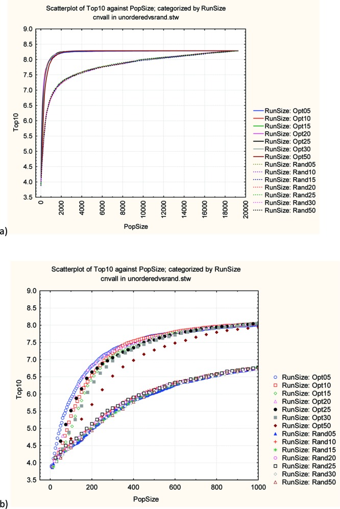
Mean activity of the top 10 most active compounds selected so far as a function of population size. The results represent the average of 50 runs at each generation size. (a) Overall performance with the optimization runs as solid lines and the random runs as dotted lines. (b) The early part of the plot up to a population size of 1000. The random runs all overlap in the lower curve.