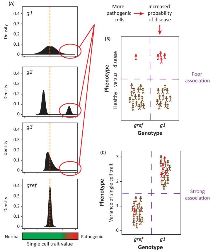
Figure 2. A scenario where single cell probabilistic trait loci (scPTL) mapping has greater potential than a classical approach.
(A) A single cell trait, such as the expression level of an oncogene, is pathogenic at high values. Graphs represent distributions of the trait value (x-axis) among isogenic cells for four individuals having genotype gref, g1, g2, and g3, respectively, at a given locus. This locus is a scPTL because the distributions are significantly different, but it is not a QTL because the mean trait value (orange broken line) is the same in all four individuals. Genotypes g1, g2, and g3 generate more pathogenic cells than genotype gref, thereby increasing disease risk. (B) Corresponding data set used if a classical approach is applied. Brown and red symbols represent healthy and diseased individuals, respectively. Due to incomplete penetrance, only few individuals carrying the g1 genotype at the locus display the disease. Therefore, the correlation between the macroscopic phenotype (disease versus healthy) and the genotype (gref versus g1) is weak. (C) Data set used for scPTL mapping. Symbols represent the same individuals as in (B). This time, the phenotype on the y-axis is the variance of the distributions shown in (A). All g1 individuals display greater phenotypic values compared with gref controls. This greater correlation between the ‘microscopic’ phenotype and the genotype enables detection of the locus.

