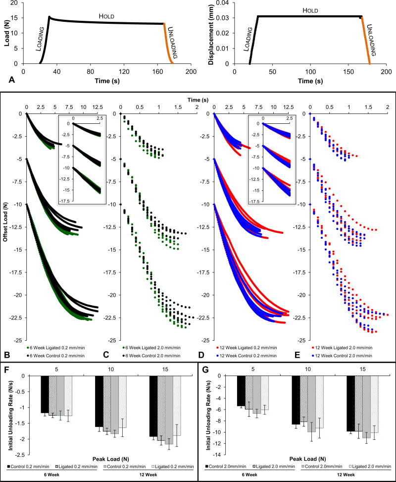
Figure 3. Load recovery response during unloading.
(A) Representative load versus time and corresponding displacement versus time plots illustrate the typical loading, hold, and unloading phases of each loading cycle. The unloading phase used for load recovery analysis is highlighted in orange. Load recovery profiles compare control and ligated fibrous joints that underwent loading at 0.2mm/min (B) and 2.0mm/min (C) at the 6-week time point and 0.2mm/min (D) and 2.0mm/min (E) at the 12-week time point. Curves were offset to for effective comparisons between control and ligated groups at each reactionary peak load. For each individual graph, the set of curves decreasing from 0N represents the unloading phase of cycles loaded to a reactionary peak load of 5N, the set of curves decreasing from −5N represents those loaded to 10N, and the final set of curves decreasing from −10N represents those loaded to 15N. Equivalent column plots compare initial unloading load rates at 0.2mm/min (F) and 2.0mm/min (G) of unloading between control (solid) and ligated (dotted) fibrous joints after 6 weeks (black) and 12 weeks (gray) of ligation. (B-E) 6-week control – black; 6-week ligated – green; 12-week control – blue; 12-week ligated – red.

