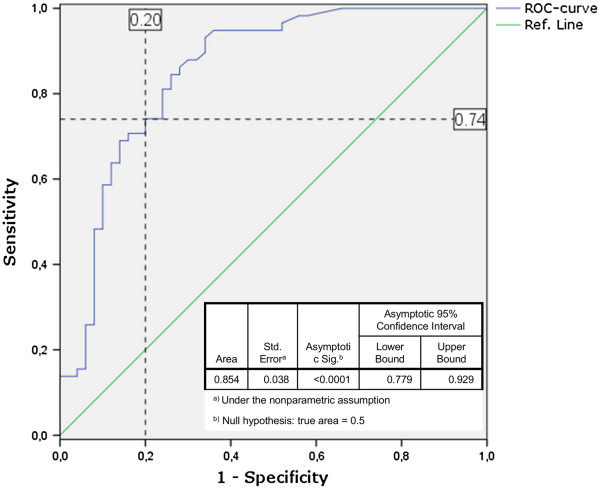
Figure 2.
ROC curve.HhaI copy numbers from infected individuals (n = 58) and non-infected individuals (n = 50) were plotted to create a ROC curve with corresponding coordinates of the curve and statistics for the Area Under the Curve (blue line). A possible threshold is shown in dashed lines with values (%) for Sensitivity (true positive rate) and 1-Specificity (false positive rate) (PASW 18.0 software package).

