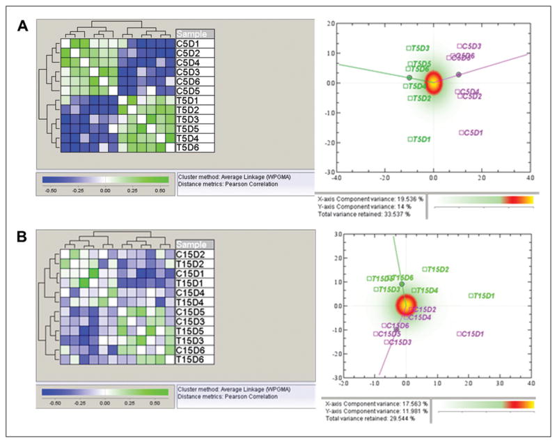
Fig. 2.
Global views of whole data set. A: Hierarchical clustering (left) and correspondence analysis plot (right) of samples from the quantile-normalized data from the 5-day experiment. In the hierarchical clustering of normalized data using Pearson correlation as distance measure, there were two main clusters which correspond to the co-culture (T) and control (C) groups. In the CA plots, the control group is displayed in pink, and the co-culture group in green. In the correspondence analysis plot for the 5-day experiment, there is a distinct separation between the control group and the co-culture group, which indicates a differential expression of genes on the global level. B: Hierarchical clustering (left) and correspondence analysis plot (right) of samples from the quantile-normalized data from the 15-day experiment. Hierarchical clustering using Pearson correlation as distance measure gives two main clusters. These clusters do however not correspond to the biological groups, but rather show that the similarity between the samples from the same donor is larger than the similarity between the co-culture and control groups. In the correspondence analysis plot for the 15-day experiment, data show a separation between the control group and the co-culture group, but not as distinct as in the 5-day experiment.

