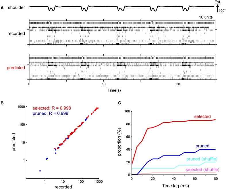
Figure 6.
Calculation of spike timing from the temporal change of the firing frequency using a fire model. (A) Raster plot of recorded spikes from 16 neurons in Monkey C (middle) and their prediction (bottom). Shoulder joint angle is shown in the top trace. Extension (Ext.) is represented by an upward deflection (arrow) of the traces; the length of the arrow represents the magnitude of the angle. (B) A logarithmic scatter plot shows the relationship between the total number of recorded and predicted spikes. Each point represents a unit selected in the encoding of the forelimb joint kinematics by the SLiR model (red) or a pruned unit (blue). The correlation coefficient (R) between the number of the recorded and predicted spikes is shown in the upper left corner of the graph. (C) Cumulative frequency histogram of time-lags that were determined by cross-correlations between the observed and predicted firing pattern. Histograms are shown for the units selected in the encoding of the forelimb joint kinematics by the SLiR model (red) and the pruned units (blue). The light red and blue bars represent the histogram of the time-lag between the observed firing pattern and the prediction from the shuffled kinematic data for the selected and pruned units, respectively.

