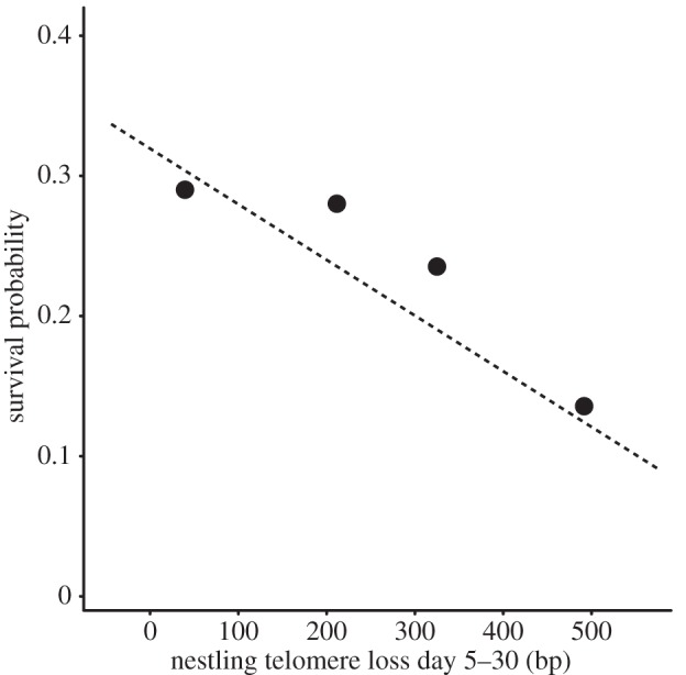
Figure 4.

Telomere loss and survival probability. The four markers show the average survival probabilities per telomere loss quartile, which were made for graphical representation only (statistical analyses were based on individual values). The line shows the logistic regression based on model 5 in table 2.
