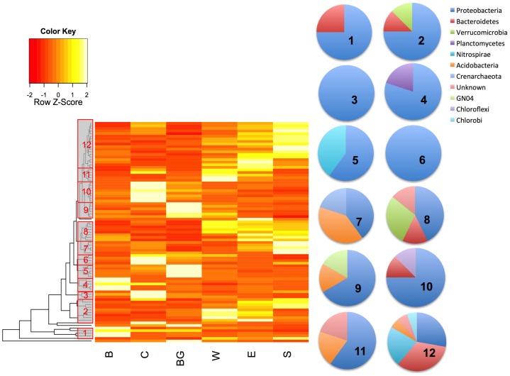
Figure 3. Relative abundance profiles of 85 abundant OTUs (more than 500 reads each) whose abundance varies by site (ANOVA, Bonferroni-corrected p<0.05).
For each OTU, abundance across sites is normalized to give a mean of zero and a standard deviation of 1.0 (Z-scores denote the number of standard deviations from the mean in either direction). Dendrogram on the left represents the results of hierarchical clustering of OTUs. Grey boxes indicate clusters of OTUs with similar abundance patterns (identified as clusters #1–12). Pie charts show relative proportion of phyla within each cluster. Yellow represents higher normalized abundance and red represents lower normalized abundance.

