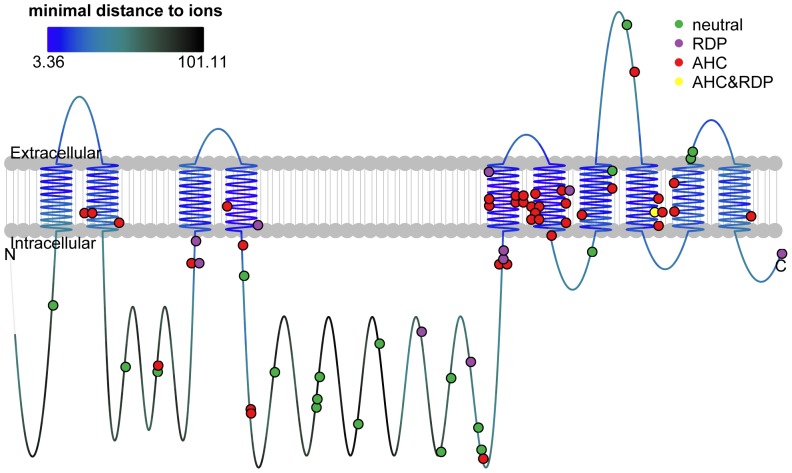
Figure 1. Locations of ATP1A3 variants and mutations shown on protein domains.
The line represented the protein and the colors of the line represented distance to metal ion binding sites, as the upper left panel showed. The dots represented variants and mutations (for insertion/deletion, the dot marked the beginning position) with the colors representing phenotype categories, as the upper right legend showed. The raw data for this figure was in Table S1.

