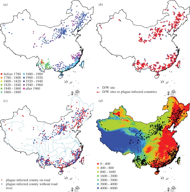
Figure 1.
(a) Plague invasion process in China during the third plague pandemic from 1772 to 1964. Points show counties where human plague was observed, with the colour showing the year when the first case was reported within the county boundary. (b) Location of hydrological stations with D/W data (blue triangle). Arrows indicate the hydrological station used for analysis of how climate affects plague spread for counties where plague manifested. (c) Red points indicate where the plague-infected county had a road going through, and blue points shows where the infected county had no major road going through. Blue lines indicate the largest rivers in China. (d) Elevation map (unit: metre) and political central location of counties with plague outbreaks. Only counties with confirmed plague cases are shown.

