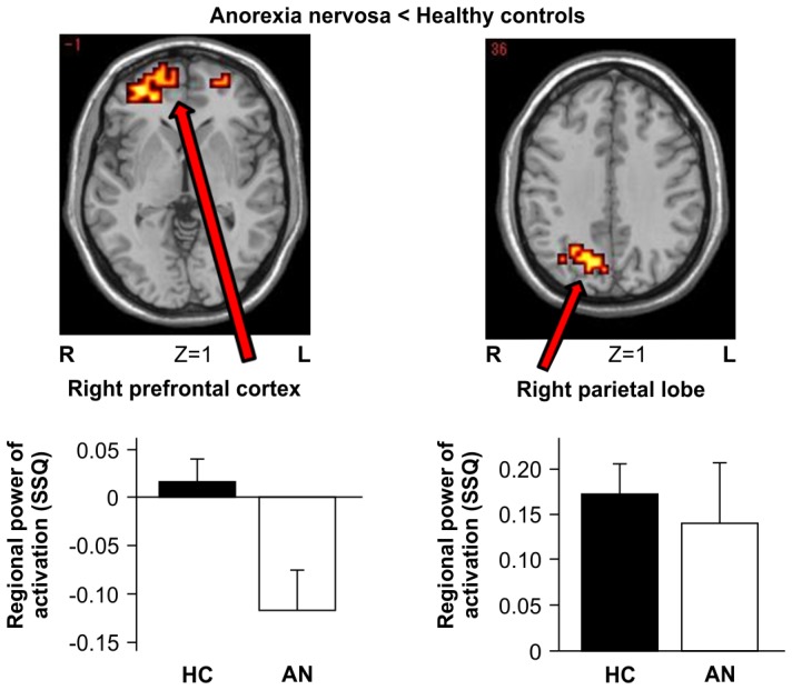
Figure 2. Between-group map activation showing activation provoked by symmetry-symptom images compared with neutral images in women with AN vs. healthy controls (HC).

Z numbers are Talairach Z coordinates. Bright yellow indicates a large difference between groups, and dark orange indicates a small difference between groups. The colour scale of the significant clusters goes from dark red to yellow, denoting the increasing difference between the groups (yellow = groups most different). The bar charts show the mean power and standard error of brain activation (goodness-of-fit statistics: SSQ) extracted from the illustrated clusters separated for AN and HC.
