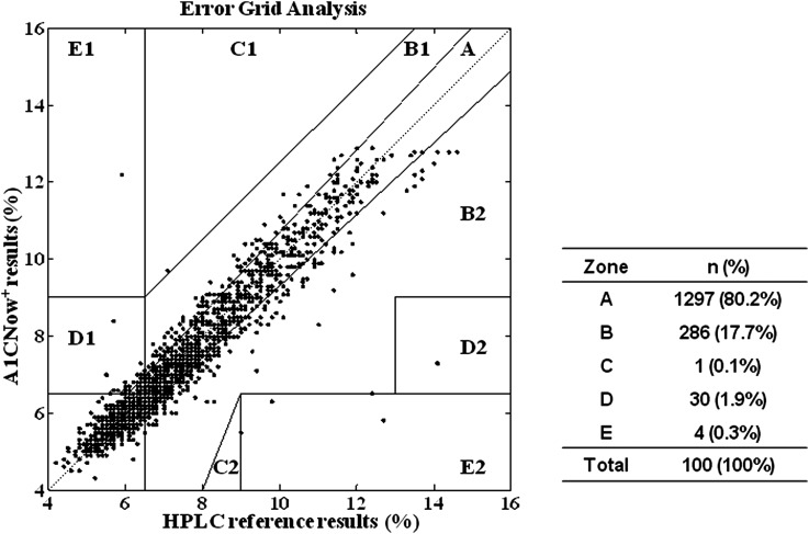
FIG. 4.
The error grid analysis graph showing the A1CNow+ results (x-axis) plotted against the high-performance liquid chromatography (HPLC) reference results (%) (y-axis). The error grid analysis scatter plot is classified into five zones (A–E) and depicts the clinical accuracy of the A1CNow+ test results. The data points in Zone A represent accurate hemoglobin A1c test results. The data points in Zone B reflect that the biases deviate beyond 7% from the reference values but remain acceptable. Zone C and Zone D data points represent results for which tight or poor glycemic control is misidentified as moderate glycemic control, or vice versa. Data points in Zone E represent results that confuse tight glycemic control and poor glycemic control and that may lead to fully wrong clinical judgment.

