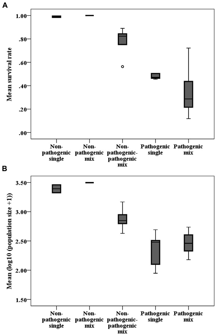
FIGURE 3.
Boxplots of (A) mean host survival rate and (B) mean logarithmic population size per strain combination of different treatments. The horizontal line indicates the median, the box the 25% quartile above and below the median, and the whiskers the data range. Circles represent outliers and stars represent extreme values.

