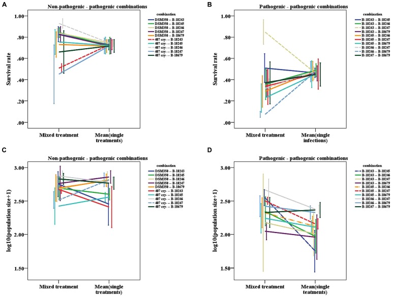
FIGURE 4.
Line graphs of mixed treatments and the mean of the corresponding two single infections. (A) Survival rate of the non-pathogenic-pathogenic mixed treatment. (B) Survival rate of the pathogenic mixed treatment. (C) Logarithmic population size of the non-pathogenic-pathogenic mixed treatment. (D) Logarithmic population size of the pathogenic mixed treatment. Dashed lines represent combinations, for which the slope differs significantly from zero, dashed-dotted lines represent combinations, for which the slope shows a tendency to differ from zero. Vertical lines represent the onefold standard error.

