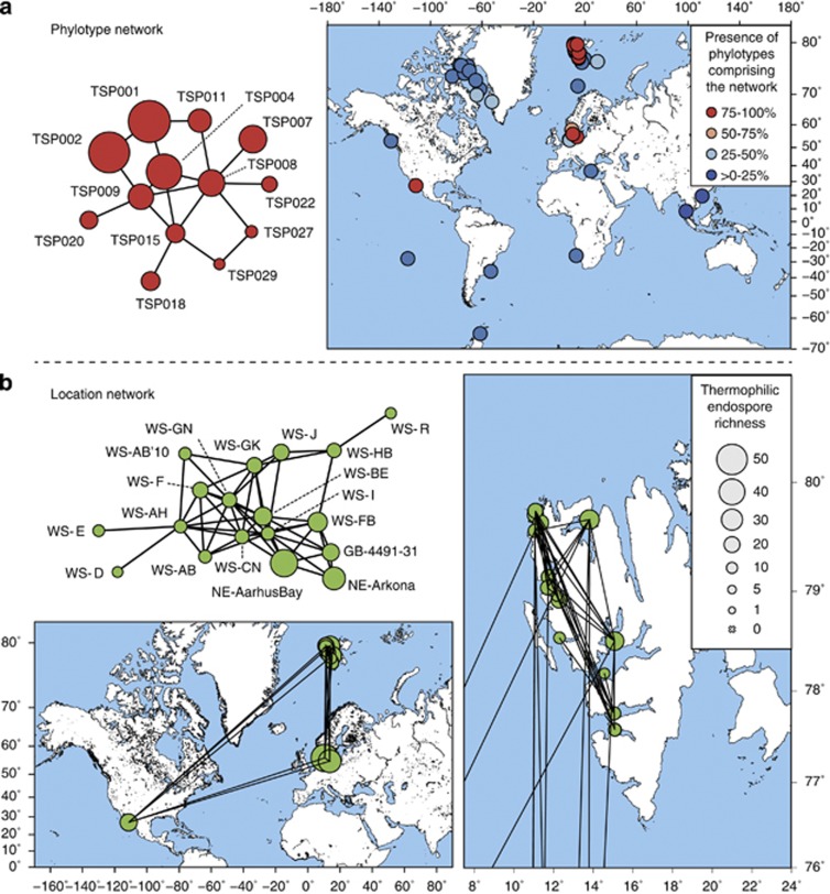
Figure 4.
Network analysis of thermophilic endospore co-occurrence (a) and location (b). (a) Largest network of co-occurring thermospore phylotypes. Each node represents a thermospore phylotype (TSP). Presence of an edge between two nodes shows a strong correlation between these two phylotypes, which is indicative for co-occurrence. Circle size indicates site occupancy. Map shows locations where phylotypes of the network are present. The circle color indicates how many of the 13 phylotypes comprising the network are present at this site. (b) Largest location network. Each node represents a location. Presence of an edge between two nodes corresponds to a high Bray-Curtis similarity (⩾0.6) between the endospore communities at these two locations. Circle size indicates thermospore phylotype richness. Maps show the global locations and correlations of these sites. The map on the right shows a magnification of Svalbard for enhanced resolution.

