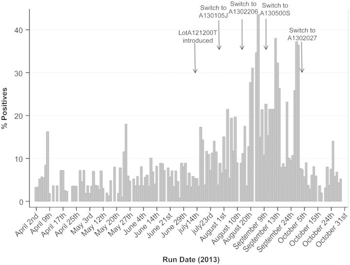
Figure 1.
The Quantiferon (QFT) surveillance graph showing daily positive rates. The bar graph displays the proportion of total QFT tests that were positive on each day the QFT was run in April through October 2013. The first arrow indicates the date a new lot was introduced and an increase in the positive test rate was noted. In August and September, lots A130105J, A1302206, and A130500S were used without a decline in the positivity rate (dates of switch denoted by arrows). The final arrow indicates the date the switch to lot A1302027 was made, resulting in a return to the baseline positivity rate.

