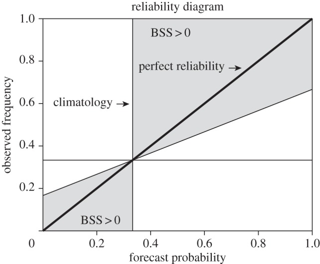
Figure 1.

What is a reliability diagram? A reliability diagram shows the observed frequencies of an event as a function of its forecast probability. The thick diagonal line indicates perfect reliability. The thin horizontal and vertical lines show the climatological probabilities of the event in the forecasts and observations (here one-third for tercile events). The grey area defines a region in the diagram where data contribute positively to the Brier skill score.
