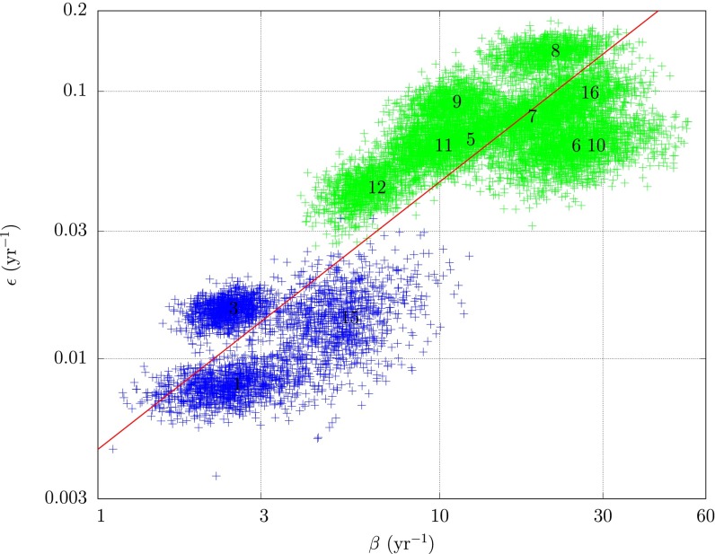
Fig. 4.
A log-log plot of primary rate of infection, ε, vs. secondary rate of infection, β; 1,000 draws from the posteriors for 12 subregions are shown. Subregions less (more) than 8 y old are shown in green (blue). Mean parameter values for each subregion are labeled by subregion number. The clustering about the 45° line shown in red shows  is roughly constant across subregions.

