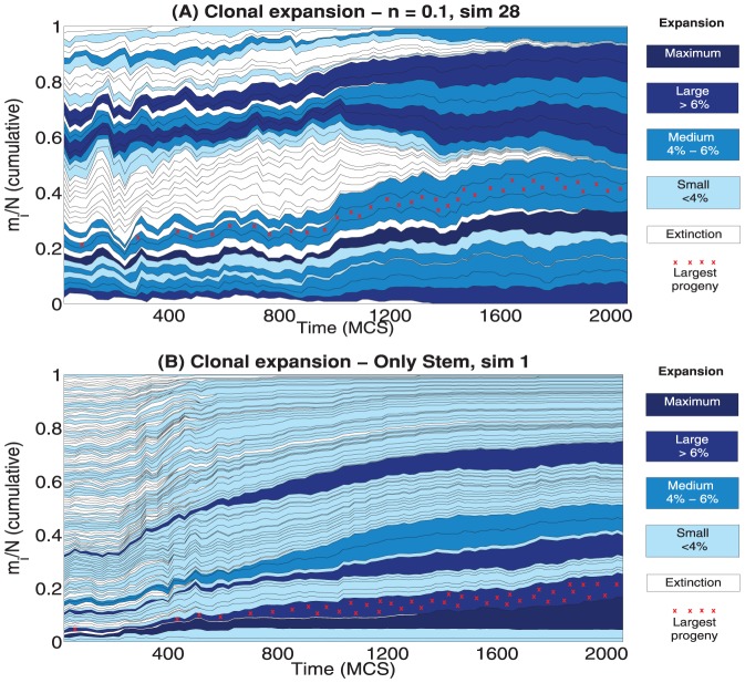
Figure 13. Clonal expansion, detail of two simulations.
Variation of the cumulative clone density  in time for the cases:
  simulation
  with
with  ,
,  simulation
  with only stem cells. The relative proportion of cells belonging to each clone over the total number of cells in the crypt at each time is shown. The blue gradient is related to different classes, accounting for the ratio of alive cells belonging to each clone at the end of the simulation. The red crosses mark the clone with the largest number of members along a simulation.

