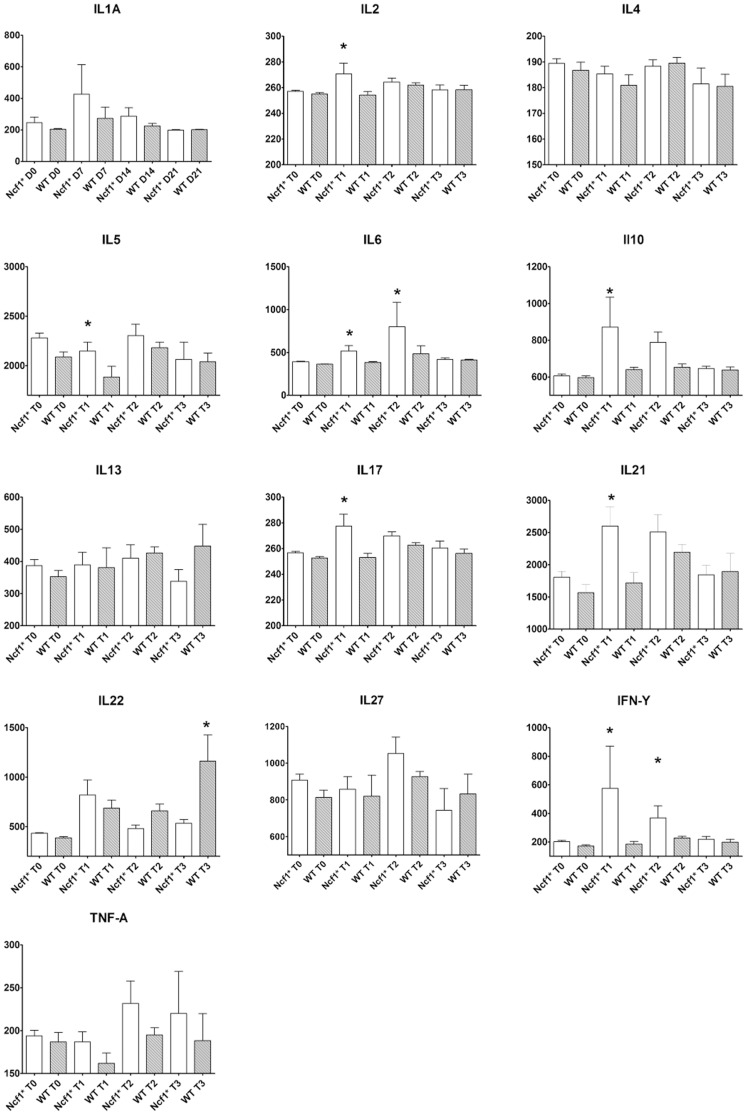
Figure 8. Variation of the serological cytokine titers in Ncf1* and WT mice during the different cycles.
Data are presented as box-plots, where the boxes represent the 25th to 75th percentiles, the lines within the boxes represent the median, and the lines outside the boxes represent the 10th and 90th percentiles. For each group at D0 (n = 15), D7 (n = 15), D14 (n = 10) and D21 (n = 5); Asterisk indicates p<0.05, Mann-Whitney test between Ncf1* and WT. White bars Ncf1*, gray bars WT.

