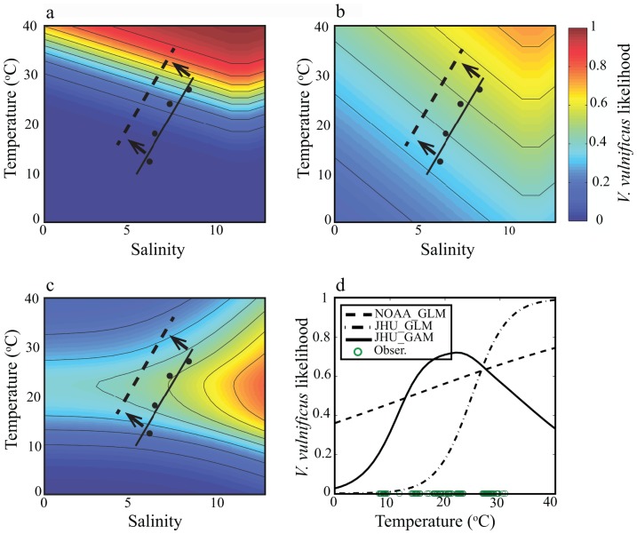
Figure 2. Contour plots of V. vulnificus probability with temperature and salinity for (a) NOAA GLM, (b) JHU GLM, and (c) JHU GAM.
Black dots represent monthly average (April-July) of in situ conditions; black lines represents in situ trend line, and dashed line represents shift in present day temperature and salinity, (d) Plot of temperature regressed against V.vulnificus probability at 11.5 salinity for each empirical method. Green circles represent the range of temperature observations during bacterium sampling.

