. 2014 Jun 3;3:e02743. doi: 10.7554/eLife.02743

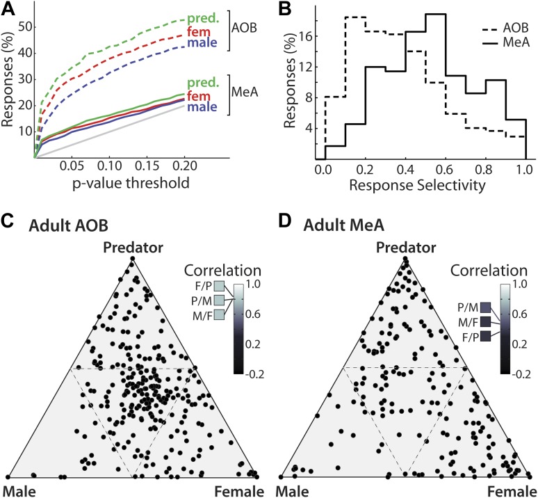
Figure 3. Decreased frequency and increased specificity of sensory responses in the MeA compared to the AOB.

(A) The percentage of single AOB units (dashed curves) and MeA units (solid curves) exhibiting statistically significant responses to male (blue), female (red), and predator (green) vomeronasal stimuli as the threshold for inclusion was varied from p<0 to p<0.2 (abscissa). The diagonal gray line indicates the predicted false positive rate. (B) Distribution of response selectivity (‘Materials and methods’) showing a shift towards higher specificity in MeA (solid line) as compared to the AOB (dashed line). (C) Selectivity of sensory responses for units recorded in the adult AOB (197 units from male and female animals). (D) Selectivity of sensory responses for units recorded in the adult MeA (274 units from male and female animals). Each point represents the response profile of an individual unit, with at least one significant response, to male, predator, and/or female stimuli. Points located near a vertex (more frequent in the MeA) represent units that respond most strongly for the stimulus indicated at that vertex whereas points at the center (more frequent in the AOB) represent units that respond similarly to all stimuli. Insets (C and D) show correlation between responses for each pair of stimuli.

DOI: http://dx.doi.org/10.7554/eLife.02743.010

Figure 3.

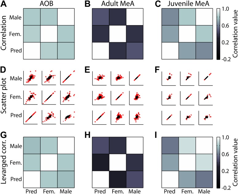
Figure 3—figure supplement 1. Leverage analysis for stimulus response correlations.

Figure 3—figure supplement 1.

(Top row) Pseudocolor plots of correlation values with all data points included. (Middle row) Scatter plot of stimulus 1 (abscissa) against stimulus 2 (ordinate) for all comparisons. High leverage points (lev >2*Rn/N; where Rn = # regression parameters and N = the size of the data set) are shown in red. (Bottom row) Pseudocolor plots of correlation values with high leverage data points omitted. Each column represents a different data set (adult AOB, adult MeA, juvenile MeA). The similarity between correlations with or without high leverage points included (A to G; B to H; C to I) indicates that the correlation is not driven by only a few neurons, but rather is a property of the population.
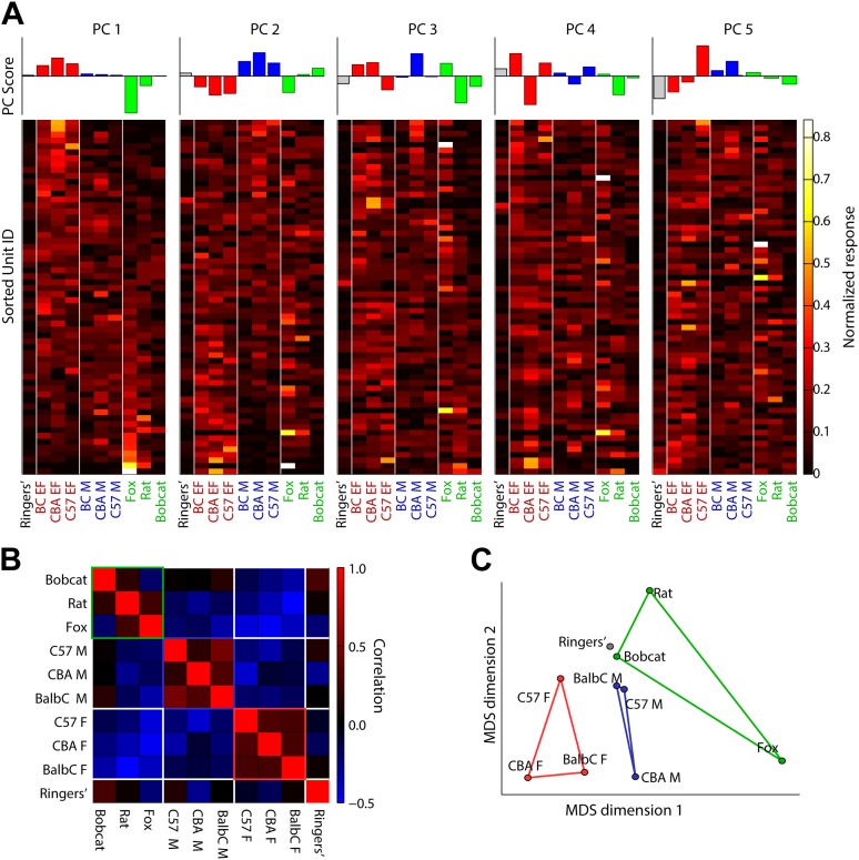
Figure 3—figure supplement 2. Principal components analysis of MeA categorization data.

Figure 3—figure supplement 2.

(A top) Principal component scores for principal components 1–5. (A bottom) For each matrix: rows indicate the normalized response of a single MeA unit to ten different stimuli drawn from three behaviorally relevant categories male (balbC M, C57 M, CBA M), female (balbC F, C57 F, CBA F), predator (fox, rat, bobcat), and a Ringer's control. Columns indicate the stimulus presented, and vertical white lines indicate category boundaries. Each matrix shows the same data set sorted by the five largest principle components. Together, these components account for over 90% of the variance in sensory responses observed in our recordings. (B) Pairwise correlation of MeA responses, for all responding units, elicited by VNO stimulation. Positive correlations between stimulus-induced responses are indicated by red and anti-correlations are indicated by blue. Within-category correlations are generally positive and between-category correlations are generally negative. (C) Multidimensional scaling analysis shows that stimuli from a single category populate a region of the response space that is non-overlapping with stimuli drawn from a different category. Lines connecting individual data points indicate ethologically defined stimulus categories.