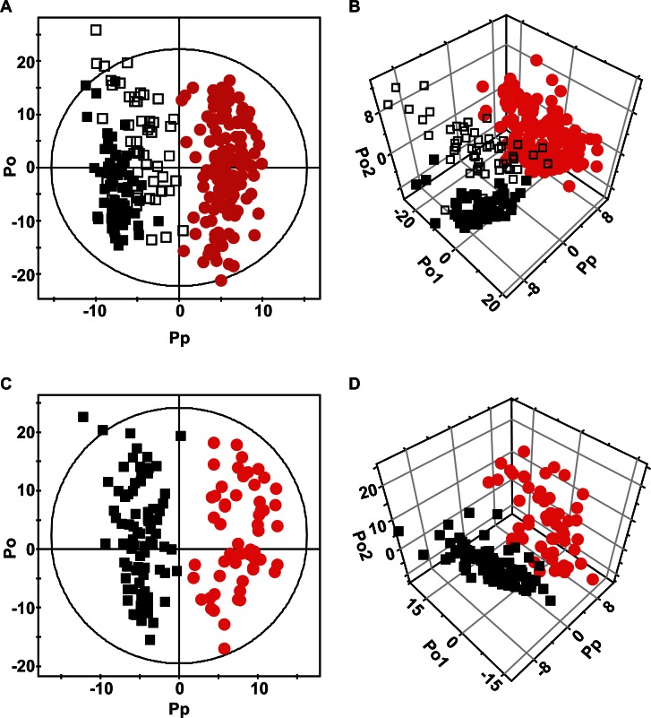
Figure 1. OPLS-DA score plots (A & C) and 3D scatter plots (B & D).
Each symbol represents the metabolomic profile of an individual sample. (A & B) Comparison of normal controls (black) and patients with bladder cancer (red). The open black boxes represent the control patients with benign hematuria. (C & D) Comparison of the two types of bladder cancer. NMIBCs are represented by black boxes while MIBCs are represented by red dots.

