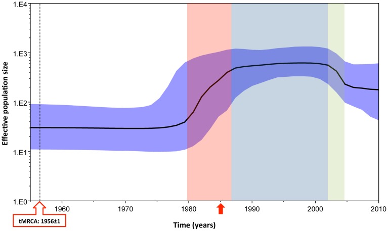
Figure 2. HIV-1 subtype A effective population size and time for most recent common ancestor.
Bayesian Skyline plot, based on a ‘relaxed clock’ coalescent framework analysis, was constructed using 113 sequences (representing all years and countries). X-axis represents time in years, while Y-axis shows the effective population size. The thick black line represents the median, while the blue band represents 95% highest posterior density (HPD) intervals. The tMRCA of HIV-1 subtype A is indicated by a black dotted line and red box, while the time for the 1985 sequence, which was the oldest reported HIV subtype A strain in the LANL Sequence Database) is indicated by a red arrow. Red, light blue and green shaded areas represent the period of increase in viral effective population size, plateau phase, and decline, respectively.

