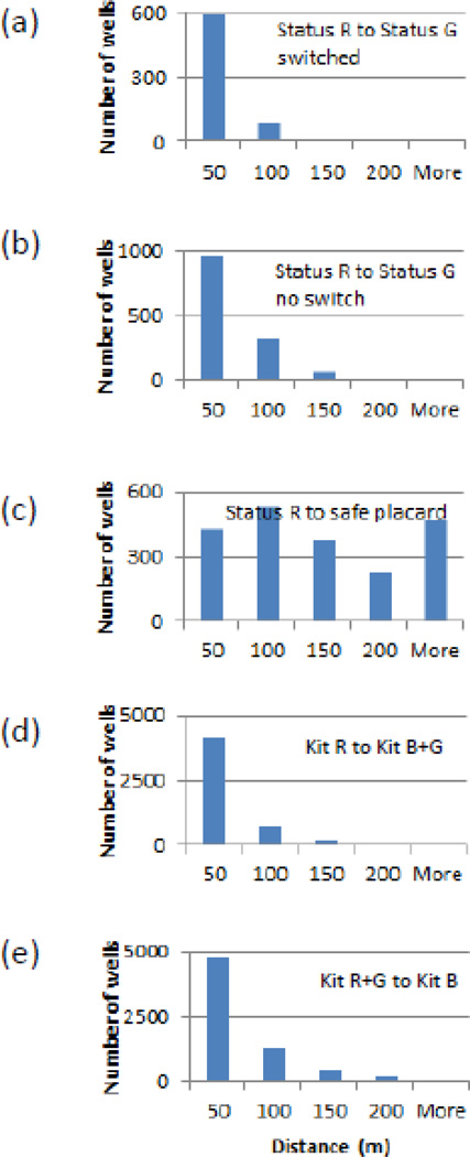
Figure 7.
Histograms of distances from an unsafe or red well to the nearest safe or green/blue well within the study area: (a) and (b) compare households that drink from a well that they perceive as unsafe to households that do not. (c) compares households that drink from a well that they perceive as unsafe to the nearest safe well with a placard still attached to the pumphead. (d) compares the distribution of distances for wells labeled red in 2012–13 to the nearest well labeled green or blue. (e) compares the distribution of distances for wells labeled red or green to the nearest well labeled blue

