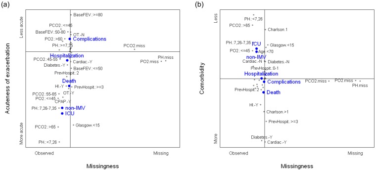
Figure 1. Graphical displays of the first component derived from the multiple correspondence analysis.
Full legend: Maps created by the second (a) and the third (b) components with respect to the first one, respectively. Black dots represent the categories of the active variables. The closer the points are, stronger is the relationship between the categories. The horizontal axis in both graphs represents the first component, interpreted as observed (left side) vs. missing (right side) arterial blood gases. (a) The second component, vertical axis, represents the severity of the exacerbation or the acute COPD process, more acute (bottom side) vs. less acute (top side). (b) The third component, vertical axis, represents the comorbidity status, more severe (bottom side) vs. less severe (top side). Blue dots represent the relative position of the outcomes.

