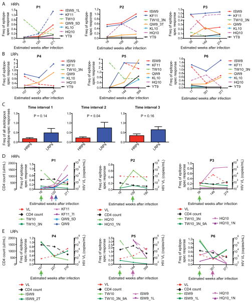
Fig. 2. Frequencies of autologous and emerging epitope variant HLA-B*5701-restricted responses over time.
The frequencies of all Gag (n=4) and Nef (n=3) autologous HLA-B*5701-restricted responses are depicted over time in A) HRPs and B) LRPs. The Y-axis illustrates the epitope-specific frequencies of total CD8+ T cells, where the colors represent the magnitude of each initial autologous HLA-B*5701-restricted responses. The dashed lines depict the responses against those epitopes that eventually developed mutations. The X-axis represents the estimated weeks after infection as the responses were measured. C) Un-paired comparisons between the magnitude of all autologous epitope-specific responses between HRPs (red) and LRPs (blue) at time interval 1–3. P-values from un-paired t-tests are provided and mean and SEM are depicted for the bars. The frequency of all autologous and emerging epitope variant HLA-B*5701-restricted responses are depicted over time in D) HRPs and E) LRPs. The dashed lines represent the HIV-1 viral load (red) and CD4 count (black) over time, where the CD4 count is depicted on the far left Y-axis and HIV-1 viral load on each subjects’ right Y-axis. The left Y-axis for each subject represents the epitope-specific frequencies of total CD8+ T cells, where the colors demonstrates the magnitude of each autologous and corresponding emerging epitope variant-restricted response. The colored arrows under the X-axis clarifies the time-points for when and which autologous and emerging epitope variants that where tested for immunogenicity.

