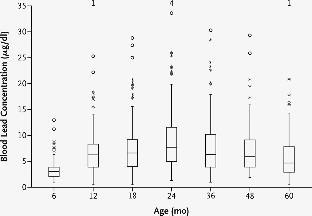
Figure 1. Distributions of Blood Lead Concentrations at Each Assessment.
In each box plot, the median value is indicated by the center horizontal line and the 25th and 75th percentiles are indicated by the lower and upper horizontal lines, respectively. The vertical lines represent 1.5 times the interquartile range, the asterisks represent values that are between 1.5 and 3 times the interquartile range, and circles represent values that are more than 3 times the interquartile range. The numbers at the top of the graph are the numbers of children with concurrent blood lead concentrations of more than 35 µg per deciliter. To convert values for lead to micromoles per liter, multiply by 0.0483.

