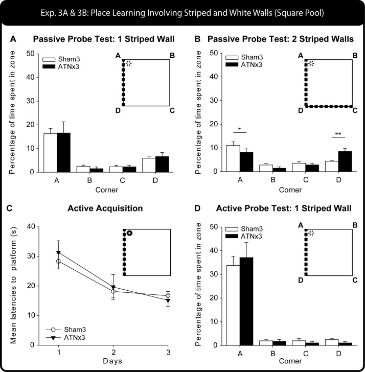
Figure 8.
Experiment 3 – Square Pool. The upper graph (A) shows performance on the first Probe Test (60 s), given after passive training with one striped wall and three white walls. The histogram show the percent of all swim time spent in each of the four corners. B) Performance on the second probe trial (60 s) after passive training (see Figure 1D) when the pool had two striped walls and two white walls. The histogram shows the percent of all swim time spent in each of the four corners, * p < .05, ** p < .01, simple effects group comparison. The lower graphs (C and D) show performance during and after active training, that is, being allowed to swim to the escape location. C) Acquisition performance measured by latency to escape, D) subsequent performance on the Probe Test (60 s) after active training as measured by corner preferences. Data shown are group means, whereas the vertical bars are the standard error of the means (SEM). For those probes that were repeated (A and B) the figure shows the combined data.

