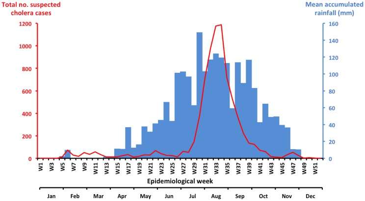
Figure 1. Evolution of the weekly cholera cases and rainfall in Guinea in 2012.
Accumulated rainfall data for the most affected areas of the country (Maritime and Middle Guinea) were obtained from satellite estimates (TMPA-RT 3B42RT derived), which was averaged on the position 9.00N-12.00N/15.00-11.75W and is available at: http://disc2.nascom.nasa.gov/Giovanni/tovas/realtime.3B42RT_daily.2.shtml. The blue bars indicate the weekly rainfall levels, and the red line indicates the number of suspected cholera cases per week.

