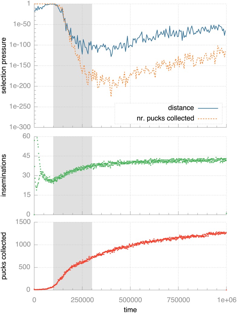
Figure 6. Quantitative analysis of selection pressure over time.
The topmost graph shows how selection pressure develops over time. Selection pressure is quantified as the p-value from Fisher’s exact test: lower values indicate lower probability of random effects and so indicate higher selection pressure. Note the logarithmic scale on the vertical axis. The two plots below that repeat the data from Figs 4 and 3 for the standard monee experiments. The gray background highlights the period (between 100,000 and 300,000 ticks) where selection pressure rapidly increases at the same time that the population becomes successful at spreading genomes and collecting pucks.

