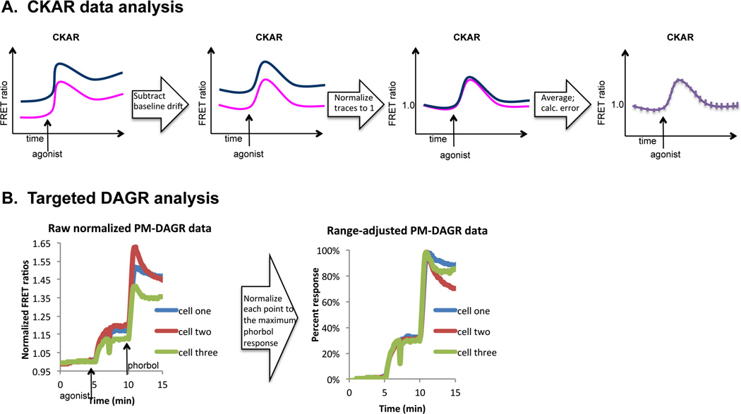
Figure 4. Data analysis.
A. Flow chart depicting typical analysis steps that yield average FRET ratios suitable for comparison across different scenarios. The far left panel is an illustration of raw FRET ratio values that drift over time. The middle left panel depicts drift-corrected FRET ratios. The middle right panel shows normalized FRET ratios, and the far right panel shows the normalized average FRET ratios with calculated error. This analysis step is described in detail in section 3.3. B. Normalization step for targeted DAGR analysis. The left plot contains raw FRET ratios from two cells transfected with PM-DAGR and stimulated with UTP (100 µM) followed by PdBu (200 nM). The right plot contains these same data normalized for the ranges of the individual cells. This analysis step is described in detail in section 3.4.

