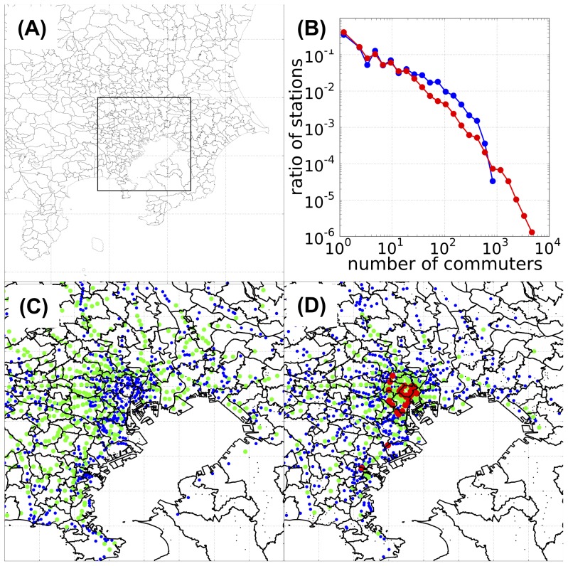
Figure 1. Commuter flow data for the Tokyo metropolitan area.
(A) Geographical location of the Tokyo metropolitan area within Kanto region, Japan. The framed rectangle shows the central part of the Tokyo metropolitan area. (B) Distribution of the station sizes on a double-logarithmic plot. Blue line, distribution of home-node stations; red line, distribution of work-node stations. (C) and (D) Geographical distributions of the sizes of home- and work-node stations, respectively, within the central part of the Tokyo metropolitan area. The color indicates the size of the station: black,  commuters; blue,
  commuters; green,
  commuters; red,
  commuters. All numbers are from the 139,841 collected questionnaires of UTC. The red-colored stations in the middle of (D) correspond to Tokyo's inner urban area (along the loop of the Yamanote line); the 2 red stations in the lower left of (D) are the Kawasaki and Yokohama stations. The longitude and latitude of each station were acquired from the Station Database [http://www.ekidata.jp].

