
Figure 6. The final size of epidemic and the arrival time of epidemic at local populations.

The final size of the local epidemic (A) and the time until the infected individuals first appear in the local population (B) (i.e., the arrival time of epidemic) plotted against the local population size. The population size is on a logarithmic scale. (A1–2) and (B1–2): results of the individual-based model (IBM) simulations; each point (dots) gives the mean value of the Monte Carlo ensemble averaged over 100 Monte Carlo runs for each local population, and the blue and red dots correspond to the results for the home and work populations, respectively. The black lines in (A1–2) give the mean value of the final size of the local epidemic for each population size class. The black lines in (B1–2) represent the regression line of the arrival time of the epidemic in the local population versus the logarithm of the population size. The regression line for the arrival time  in the
  -th home population with population size
  ,
, 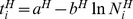 , was highly significant, with a P-value of
  in the
  test (
 with the degrees of freedom (1, 1084)),
  . The estimated intercept
  and slope
  and their
  confidence intervals (CIs) are
 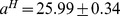 (
( CI) and
 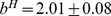 (
( CI). The same was true for the arrival times in the work population; the regression
 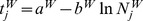 was highly significant (
 ,
,  with
with  ), with estimated intercept and slope
  (
( CI) and
  (
( CI), respectively. (A3) and (B3): corresponding results obtained from the population size class model (PSCM); the blue line shows the result for the home population and the red line the result for the work population (refer main text for details). The infection rate was
  . A person commuting from “Gyotoku” station to “Aoyama-itchome” station was designated the initially infectious individual.