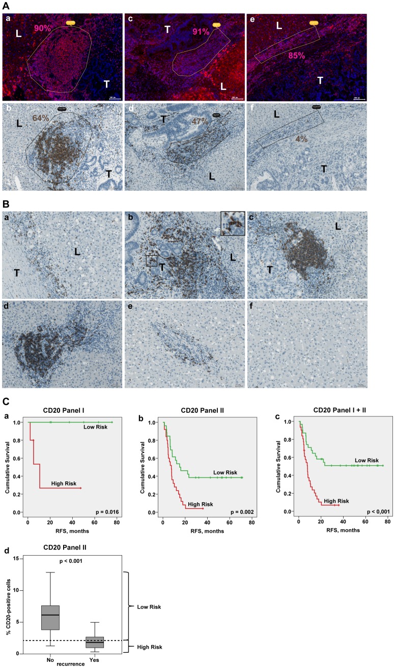
Figure 3. CD20-positive B lymphocytes at the site of CRCLM.
(A) Subpopulation of CD20-positive B cells at metastatic border. Representative examples of the CD45-positive (a) ectopic follicle, (c) large cell aggregate and (e) non-organized cell population and the corresponding areas stained for CD20 are shown (b, d, f, respectively). Quantitative analysis was done using TissueQuest and HistoQuest software; percentage of positive cells is indicated. Scale bar: 100 µm. (B) Different organisation patterns of CD20-positive cells within the three regions of interest. Representative images (i) at the border: (a) single cells, (b) cell aggregates; insert: higher power view of CD20-positive cells in contact with the colon tumor epithelial cells, (c) ectopic follicular structures; (ii) around the portal veins (d) proximate to the border and (e) distant to the border as well as (iii) within liver tissue (f) are shown. T: tumor; L: liver. Scale bar: 50 µm. (C) Kaplan-Meier estimates for patients stratification based on the CD20-derived values at the border. Kaplan-Meier curves for RFS based on CD20 values for panel I, panel II and panel I+II are shown giving patient stratification into low and high risk groups (higher than median indicates low risk); p value of the log-rank test is indicated. Panel I: median is equal to 2.70, below median n = 5, above median n = 6; panel II: median is equal to 2.11, below median n = 25, above median n = 26; panel I+II: median is equal to 2.22, below median n = 31, above median n = 31. (d) Boxplots of CD20 data sets for patients without recurrence (No) versus patients with recurrence (Yes) at the time point of 24 months. The cut off was set according to the latest event occurrence (23.3 month) where no censoring has occurred, giving separation from the censored subjects (≥29.4 months) as visualized on (b). Dashed line: the median CD20 value, which was used for patient stratification into low and high risk groups on Kaplan-Meier plot (b); p value is shown (t test).

