
Figure 3.
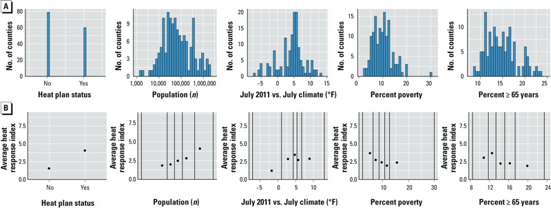
County characteristics: distributions and associations with heat response in 2011 (n = 117). (A) Distributions of heat plan status, county population, difference between July 2011 and July climate (average of daily July maximum temperatures in 2011 – average of daily July maximum temperature values, 2001–2010), percent poverty, and percent of population ≥ 65 years of age. (B) Average heat response index in 2011 in each quantile bin for that county characteristics. All counties were divided into five bins based on the county characteristics, with breaks between bins at the 20th, 40th, 60th, and 80th percentiles of the characteristic; black vertical lines show divisions between bins as well as minimum and maximum values; points are positioned on the x-axis at the median characteristic value for the counties within the bin.