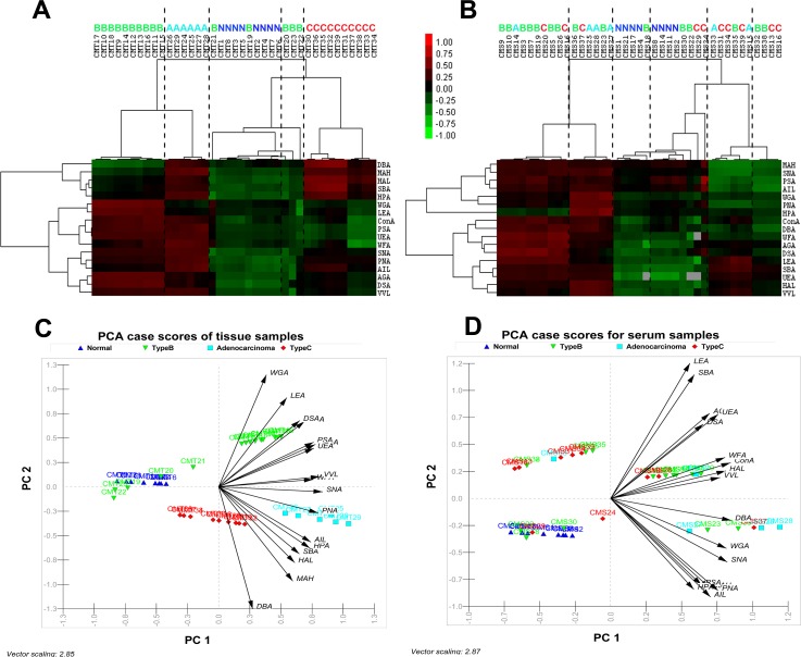
Figure 4.
Unsupervised average linkage HC of the lectin array responses to tissue (a) and serum (b) samples of the four clinical groups. The contour plots also represent the glyco-codes of corresponding four clinical groups. Mean-normalized data were analyzed by Cluster 3.0. Positive: red, negative: green, black: zero and grey: missing data. Clustering method: complete linkage. The heat map with clustering was acquired using Java TreeView. The normalized lectin microarray responses to four groups were visualized by PCA. Tissue samples (c) and serum samples (d) were represented in corresponding Biplots (containing vectors superimposed over the scatter data points) to provide graphical representations of the relationships among the samples on the basis of their glycan expression. The direction of an arrow of a particular lectin points toward the samples show maximum binding with the corresponding lectin. Moreover, the length of the vectors signifies level of binding.

