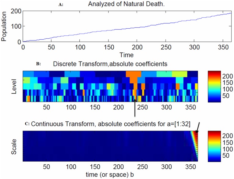
Figure 9. Snapshot of the recovery population.
An increase in natural deaths was observed after 50 days due to the outgoing moves from the infectious and recovery populations to the natural death population (Figure 9A). The range of frequencies used in averaging is indicated by the arrow at 362 days, which corresponds to the peak of the disease spread (Figure 9C).

