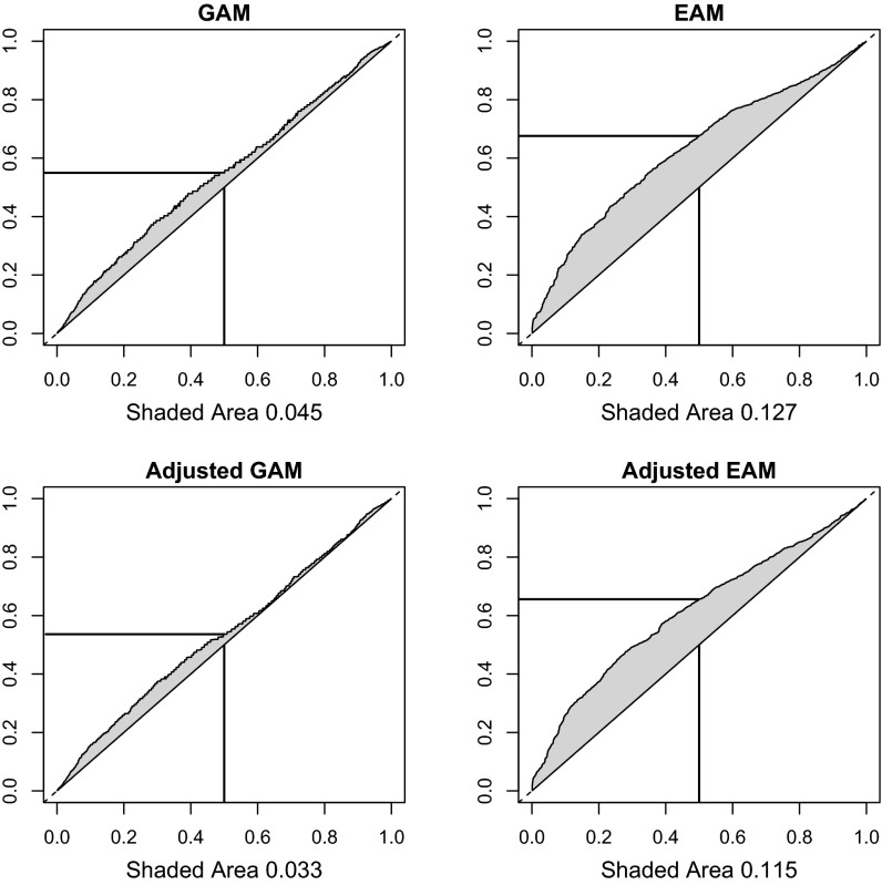
Fig. 1.
Graphical representation of GAM and EAM. The y axis charts quantiles of the distribution of kinship or squared educational differences between all pairs. The x axis charts quantiles of the same distribution but restricted to just cross-sex white spousal pairs. The shaded area in each gives an estimate of assortative mating. The horizontal and vertical lines aid in interpretation. In Upper Left, one can observe that the genetic relatedness estimate at the 0.5 quantile of spousal pairs corresponds to the 0.55 quantile of all pairs. Adjusted GAM (Lower Left) includes control for same birth region (census division). Adjusted EAM (Lower Right) includes a control for kinship between the pairs.

