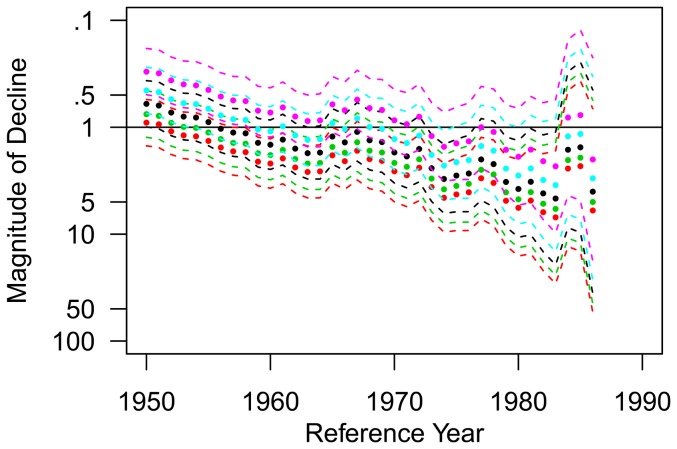
Figure 9. White shark relative decline in abundance.
Estimates of relative decline in abundance (filled circles) with 95% credible intervals (dashed lines) for any reference year between 1960 and 1986 assuming no change in observation effort (black plot), a 25% and 50% increase in observation effort (green and red plots, respectively), and a 25% and 50% decrease in observation effort (blue and purple plots, respectively). Note that the scale for the y-axis has been reversed when compared to Figure 8 to visualize the declining trend in abundance during this time period.

