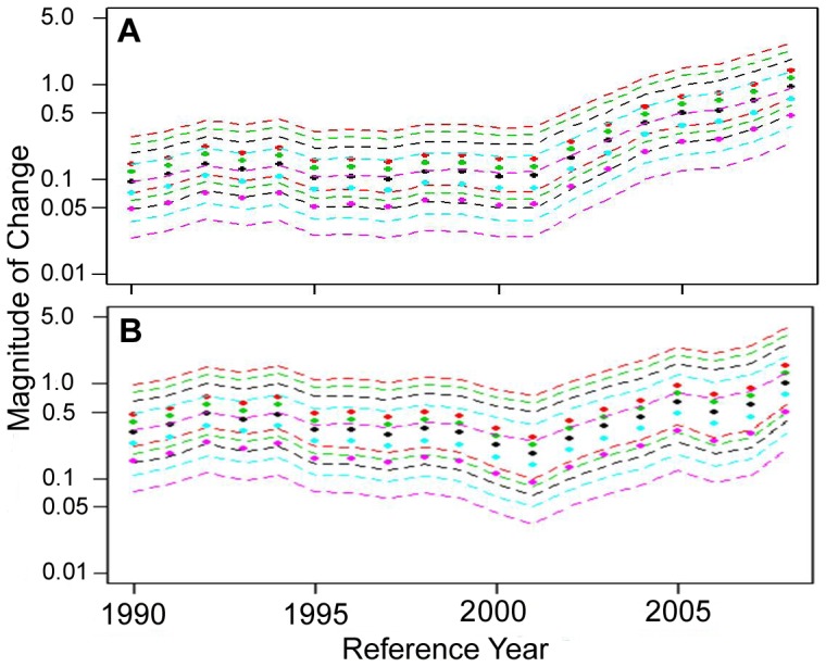
Figure 11. Recent trends in white shark relative abundance.

Estimates of relative change in abundance (filled circles) with 95% credible intervals (dashed lines) for any reference year between 1990 and 2008 assuming no change in observation effort (black plot), a 25% and 50% increase in observation effort (green and red plots, respectively), and a 25% and 50% decrease in observation effort (blue and purple plots, respectively) for the original sightings time series from 1990 to 2009 (a) and the time series with sightings that occurred near Monomoy Island during that time frame removed (b).
