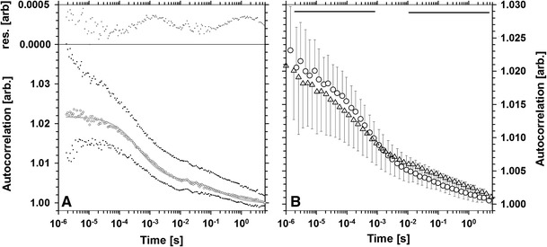
Fig. 4.

Fluorescence autocorrelation curve (a) corresponding to regions of low concentration of H1 shown as median (circles) with 5th and 95th percentiles (dots). The fitted two-component model is represented with a solid gray line (bottom part) and the residuals with crosses (top part). Comparison of mean autocorrelation curves (b) corresponding to areas of low (circles) and high (triangles) H1 concentration. Error bars correspond to the standard deviation. The regions where the two curves are different (p < 0.01) are marked with solid horizontal lines
